
0
Pinebits created
- ABP Framework version: v6
- UI type: Angular
- DB provider: EF Core
- Tiered (MVC) or Identity Server Separated (Angular): MVC
I have upgraded to v6 and LeptonX Pro theme, but the abp-lookup-input components are not following the LeptonX Pro design theme. When is that changed or can I update it my self?
3 Answer(s)
-
0
Hello,
Can you send screenshots?
I checked in version ABP 6.0.0 version and Lepton 1.0.0 version
-
0
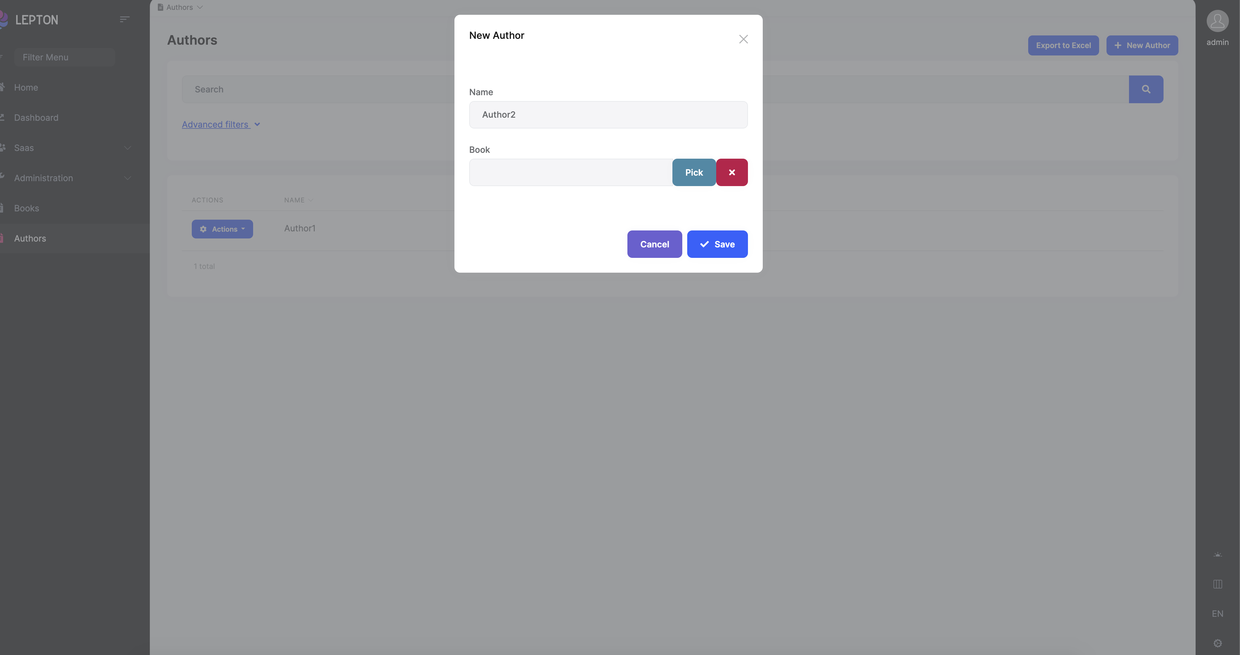
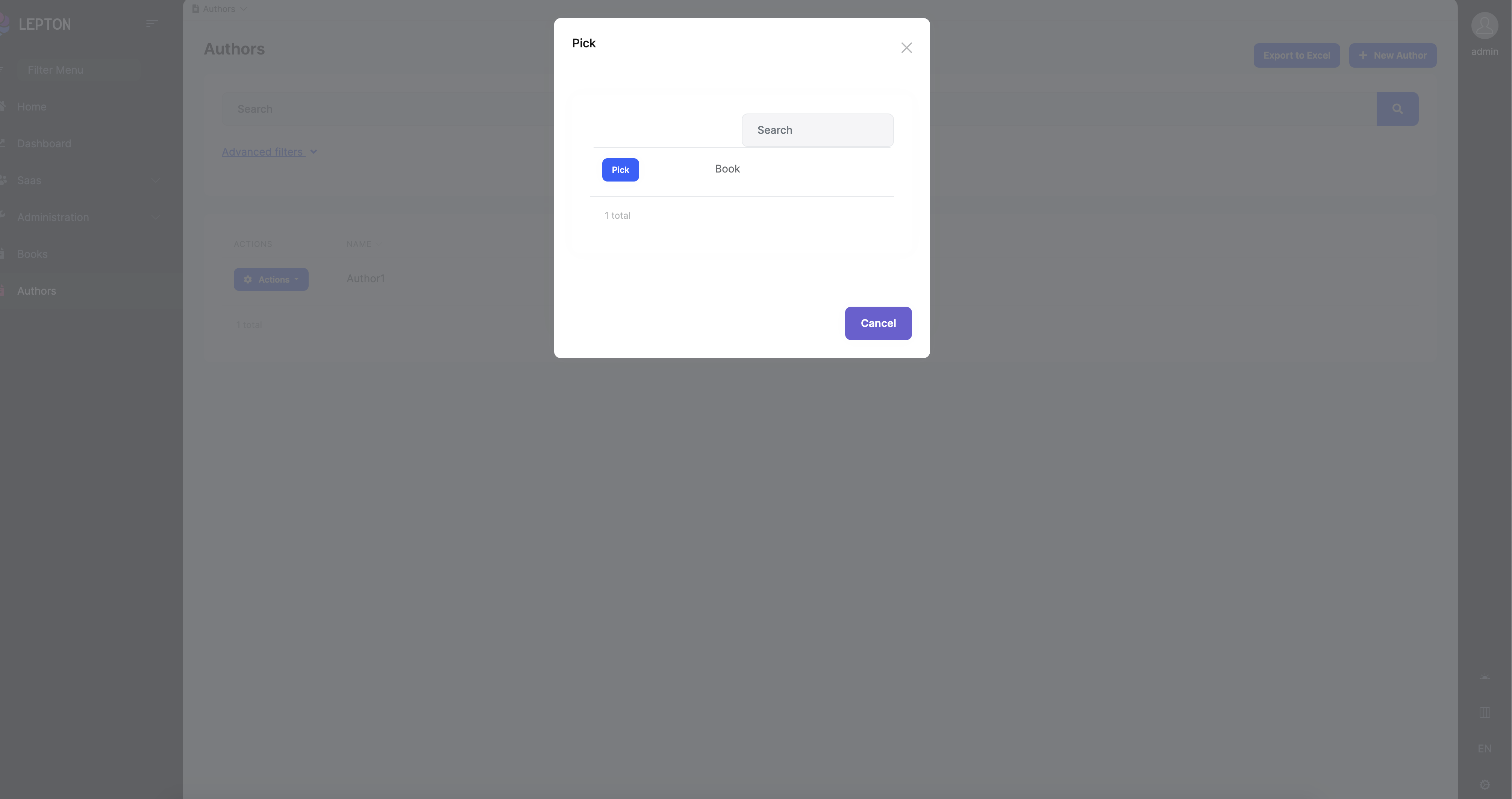
Yes - currently it looks like this:

And it should look like this:

(I have hacked the code directly in the browser so it does not work properly)
-
0
Hello,
I opened an internal issue about this bug. Thanks for reporting.
For now, you can change abp-lookup-component with yours.
- Create folder named my-lookup and create a file inside this folder named my-lookup-input.module.ts
import { CoreModule } from '@abp/ng.core'; import { ThemeSharedModule } from '@abp/ng.theme.shared'; import { NgModule } from '@angular/core'; import { CommercialUiModule } from '@volo/abp.commercial.ng.ui'; import { MyLookupInputComponent } from './my-lookup-input.component'; @NgModule({ declarations: [MyLookupInputComponent], imports: [ThemeSharedModule, CoreModule, CommercialUiModule], exports: [MyLookupInputComponent], }) export class MyLookupInputModule {} - Create a file named my-lookup-input.component.ts
import { Component } from '@angular/core'; import { LookupInputComponent } from '@volo/abp.commercial.ng.ui'; @Component({ selector: 'my-lookup-input', templateUrl: './my-lookup-input.component.html', }) export class MyLookupInputComponent extends LookupInputComponent {} - Create a file named my-lookup-input.component.html
<div class="input-group"> <input [id]="cid" type="text" class="form-control" disabled [ngModel]="selectedName" [class.input-validation-error]="isInvalid" /> <button *ngIf="pickButton.show" [disabled]="pickButton.disabled" class="btn btn-info" type="button" (click)="onClickPick()" > {{ { key: '::Pick', defaultValue: 'Pick' } | abpLocalization }} </button> <button *ngIf="clearButton.show" [disabled]="clearButton.disabled" class="btn btn-danger" type="button" (click)="onClickClear()" > <i class="fa fa-times"></i> </button> </div> <abp-modal [(visible)]="isModalVisible"> <ng-template #abpHeader> <h3>{{ { key: '::Pick', defaultValue: 'Pick' } | abpLocalization }}</h3> </ng-template> <ng-template #abpBody> <abp-lookup-table [getFn]="getFn" [lookupNameProp]="lookupNameProp" (pick)="pick($event)" ></abp-lookup-table> </ng-template> <ng-template #abpFooter> <button type="button" class="btn btn-secondary" abpClose> {{ 'AbpUi::Cancel' | abpLocalization }} </button> </ng-template> </abp-modal> - Import
MyLookupInputModuleto your module's imports array - Change
abp-lookup-inputtomy-lookup-input
- Create folder named my-lookup and create a file inside this folder named my-lookup-input.module.ts
